Revitalize
Coffee
Art Direction
Brand Strategy
Logo
Visual Identity
Style Guide
Merchandise
Packaging
Website
Social Media Content
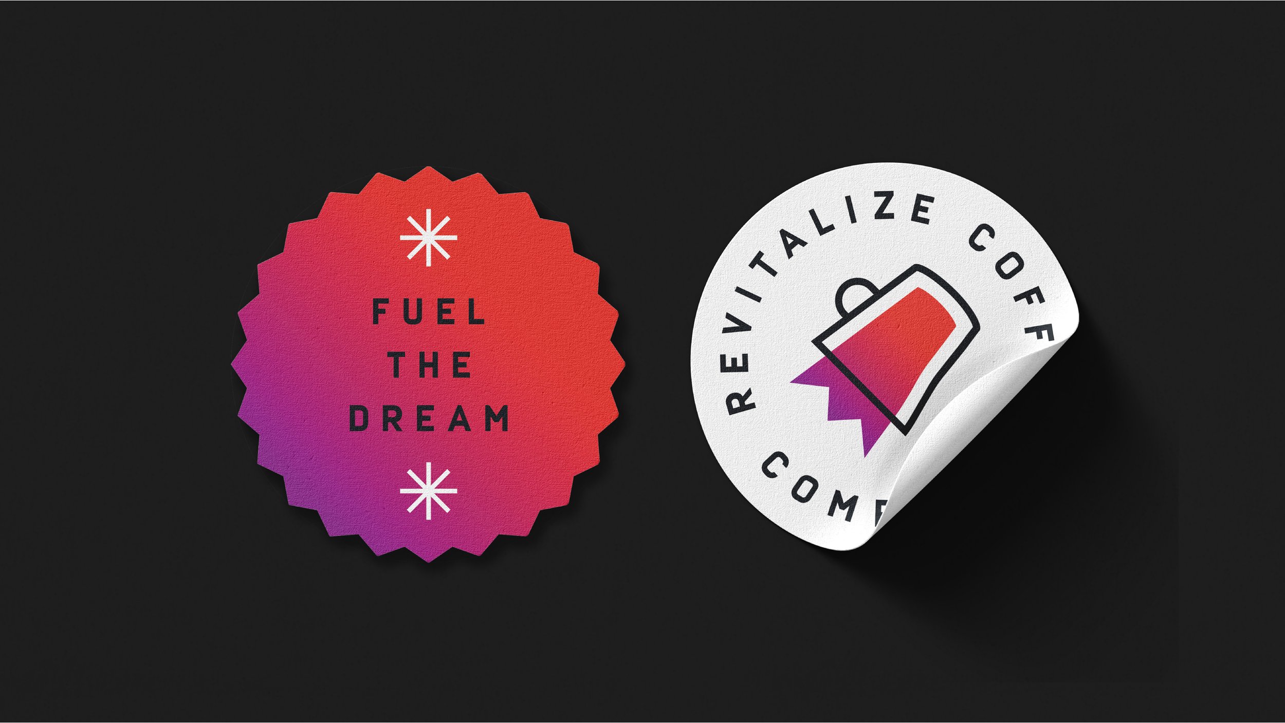
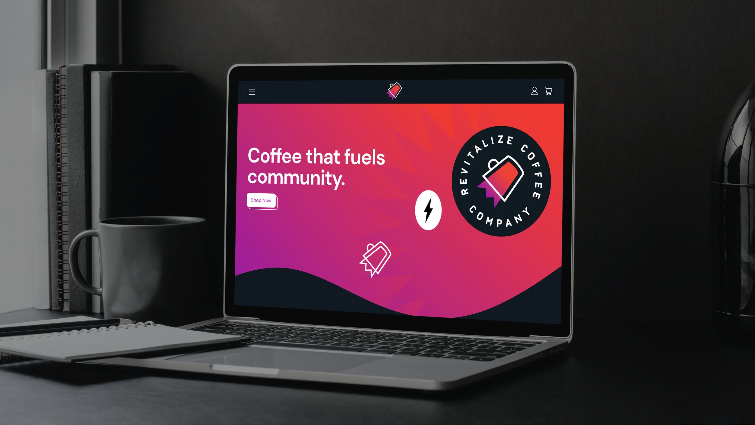
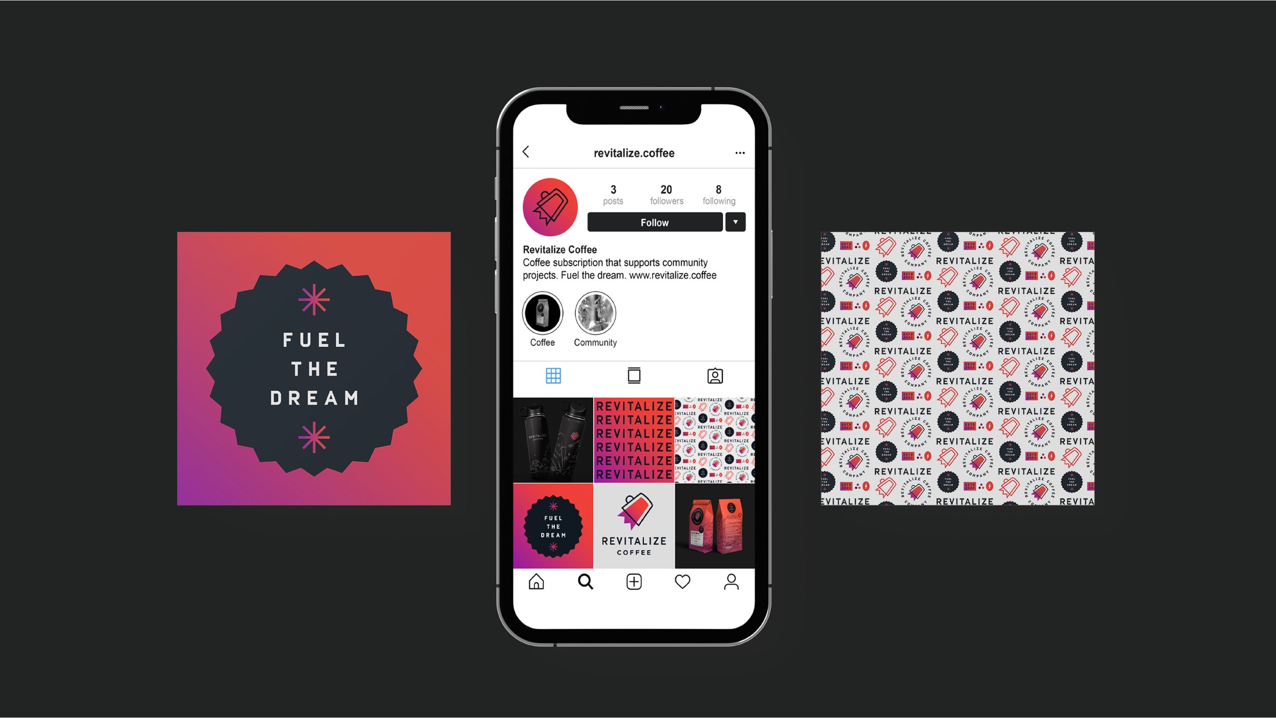
Revitalize Coffee is a coffee subscription with the intention to give back to the community by funding local improvement projects through their coffee sales. We started first by building their brand strategy, which resulted in the positioning “We make life more vibrant.” This speaks to the energizing benefits of coffee as well as the community revitalization projects. This positioning was reflected in the visual identity — through a dynamic logo suite, bright colors, fun patterns, cheerful typography, and active, playful interactions on their website. You’ll notice that the logomark is a coffee mug blasting off into the sky. It was coined the ‘rocketcup’, which conceptually represents the catalyst that Revitalize is for both coffee drinkers and making communities more vibrant.
Collaborators
Tom Cullen and Stevie McLain (cofounders)
Awards & Features
2022 Gold ADDY for Integrated Brand Campaign (AAF Buffalo)
2022 Gold ADDY for Logo Design
(AAF Buffalo)
2022 Judge’s Choice ADDY for Logo Design
(AAF Buffalo)
2022 Silver ADDY for Integrated Brand Campaign (Regional District 2)
2022 Silver ADDY for Logo Design
(Regional District 2)


